EVO Brand refresh
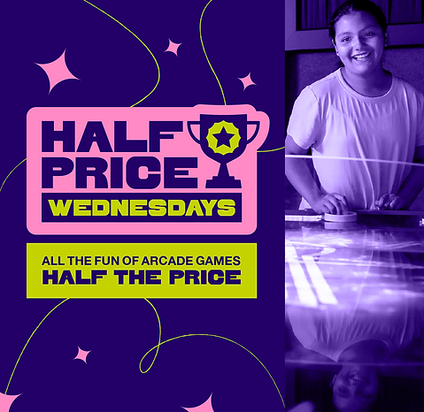
When I began working with EVO Cinemas, a creative agency had just finalized a creative container for the brand that would determine its external look and feel for 2-3 years. While it incorporated fun textures and a trendy display font, I immediately noticed the challenges I would face implementing their chosen style. The selected palette wasn't WCAG contrast-compliant, the chunky display text didn't include glyphs, and the overall identity didn't complement the energy within the venues, which buzzed with arcade games, tempted taste buds with scratch cuisine, and boasted multiple premium large format movie screens.
When the company changed ownership a few years into my tenure I got the chance to correct these design issues and create a style that better reflected the brand. Some of my desires were met with pushback, like changing our display font, but I pivoted whenever necessary — in this case, creating a supplemental glyph font that wildly improved usability.